Liberti Church River Wards raised $1.4M for the purchase and renovation of a new church building.
Philamedia created the identity and digital platform for the campaign.
Creative Director: Beau Rosario
Illustration: Mike Townsend
Graphic Design: Ben Bond, Beau Rosario
Web Design: Beau Rosario
Media Production: Brandon Gulish, Grant Woodworth, Aidan Guynes, Beau Rosario
Copywriters: Phil Stoltzfus (print), Brandon Gulish (web)
Communications Director: Phil Stoltzfus
Printer: Fireball Printing
This part of our portfolio is not available for mobile viewing. Please open on a desktop device.
Liberti Church, a church in the river wards section of philadelphia is undergoing its largest campaign, and a shift in its vision. This phase in the church’s story called for all-new everything for the campaign.
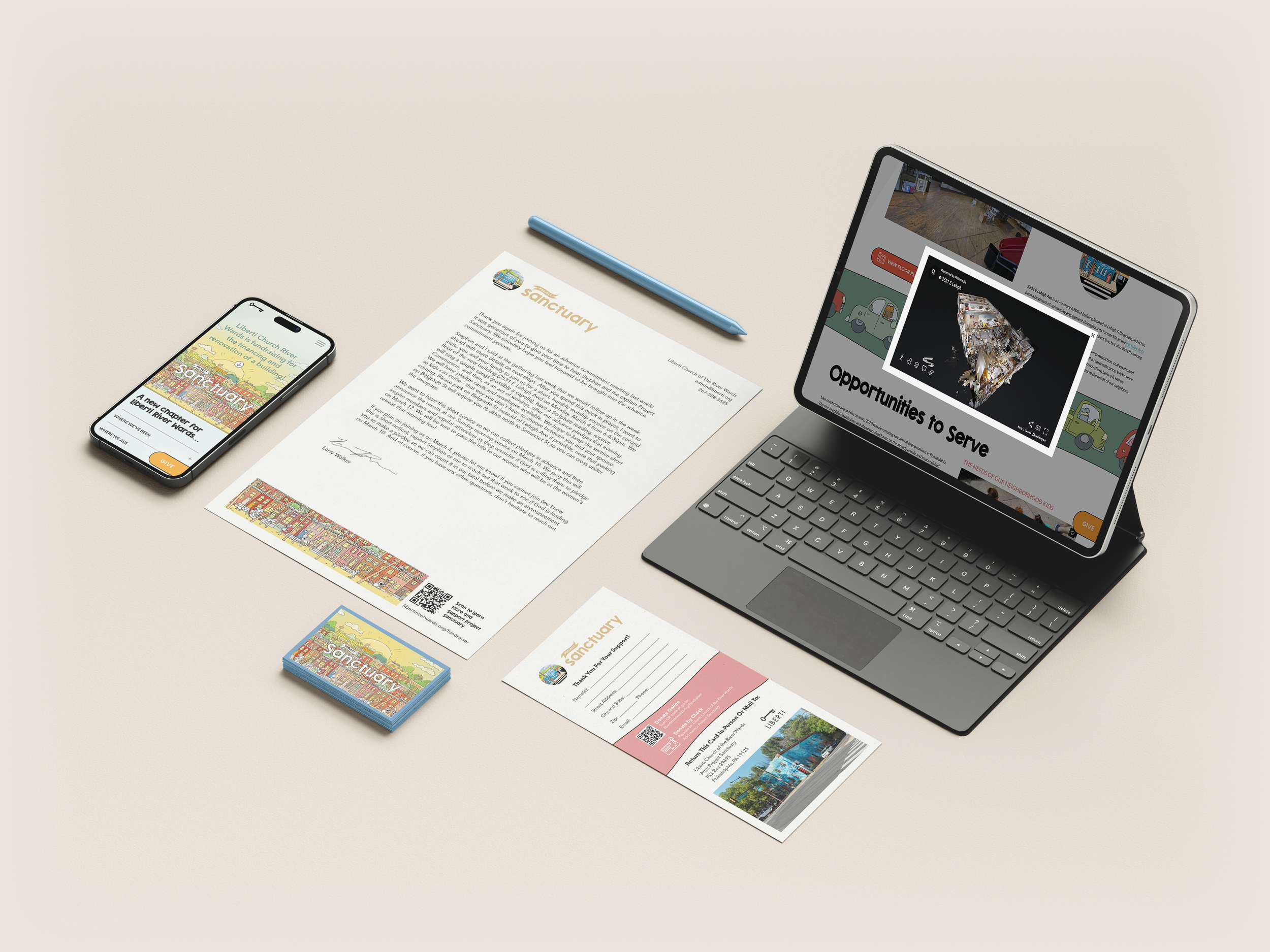
The assignment was a soup-to-nuts design and launch of a fundraiser for Liberti’s purchase and renovation of a building. The project included branding and logo design, web design, video production, photography, virtual tour capture, print materials, email campaigns, and a blog.

We knew just where to start…
Illustrations. Fun ones. The concept was to capture a vision of Liberti’s neighborhood in a way that reflected the buzz and life of the surrounding blocks. Our church is chock full of amazing artists, and Illustrator Mike Townsend was the one to bring this vision to life.
The instructions were something like, “Make it like ‘Where’s Waldo’ but in the river wards.” And of course, he nailed it.

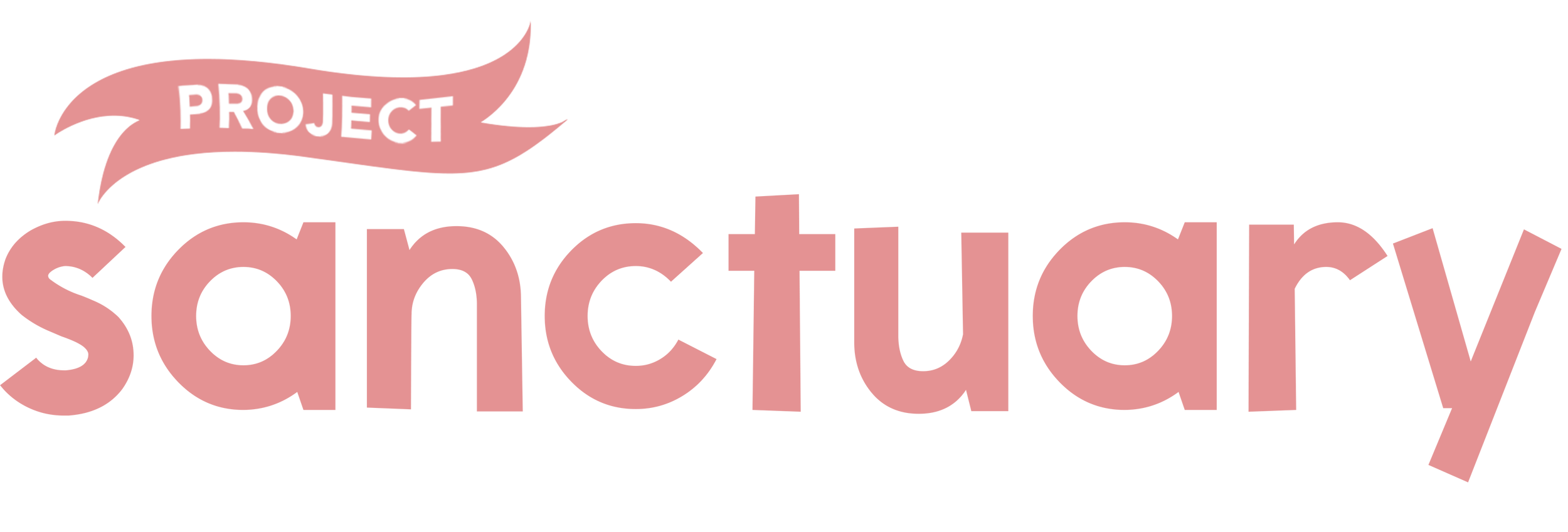
Project Sanctuary’s Key Art
Colors
With the church’s new building, Liberti is most excited to launch programs that will invest in the children of the river wards. Project Sanctuary’s color palette is an important reminder of what this campaign is all about.


Responsive, mobile-friendly website
A fundraiser is only as good as its platform, and we built one to cover a lot of ground. Lightboxed virtual tours, an always-on floating donation button, and dynamic tabbed sections are some of the few features that make the UI easy to navigate.

Found on the website…
The website opens with animated elements and smooth scrolling to clarify the flow of the site. From there we tell the story of Liberti and its new opportunity, paired with graphics, photographs, and videos for a deeper dive.
Brand-matched, stylized elements throughout the site.

Lightboxed, embedded, shareable custom media assets.

Integrated Forms & Email Capture with Mailchimp and Zapier.
It’s at the core of everything we do at Philamedia. So, naturally we produced a few videos for this campaign.
Videos

Print materials that are easy to read, and easy on the eyes
Graphic Designer Ben Bond drew from Mike’s illustrations to inform the rest of the design. Sketched outlines, and wavy borders keep the spunk and playfulness throughout the brand, and iconography is used to keep the copy to a minimum

Anatomy of a wordmark…
We needed a textual logo that could serve two purposes. For one, we really wanted something that would integrate well with Mike’s art and feel embedded in the scene. We placed the “sanctuary” text behind elements like birds and telephone poles to make it feel like part of the cityscape. To balance out the weight of the larger character at the end (the “y”) the beginning “s” is slightly enlarged. In this context, we kept the black outline to match the illustration. Finally, we experimented with ways to bring in the word “project.” The smaller size made it illegible only as text, so we played with different ways to make it part of the scene- we even tried having a little man painting a billboard with the word on it, but unfortunately that concept was too much part of the scene, and would not work for our other use case…
The logo also needed to stand on its own, serving the campaign’s letterhead and other assets where the full art was not appropriate. The font choice was important it still needed to convey the playfulness of the brand even on its own. We experimented with about a dozen fonts until we landed on English Island, all lower-case. To compliment its blocky structure, we put “project” in a banner, giving the feeling of a waving flag and bringing some energy to the wordmark.

.01

.02
Iconography


Photography
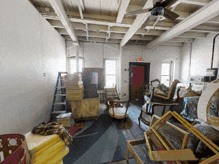
Our architectural photographers captured the building inside and out, and photographed the surrounding neighborhood as well. Since pictures are worth a billion words, I guess that makes us copywriters?
Virtual Tours
Philamedia created immersive 3D Virtual Tours which gave donors a look into the not-yet-purchased property, and gave architects a starting point for renovation plans.
Aerials
Show of hands, how many drone operators have filmed a giant fish tank on the streets of Philadelphia?
Besides using aerials for the promotional video material, Liberti’s construction team even used our footage to inspect the roof of the property before purchasing!

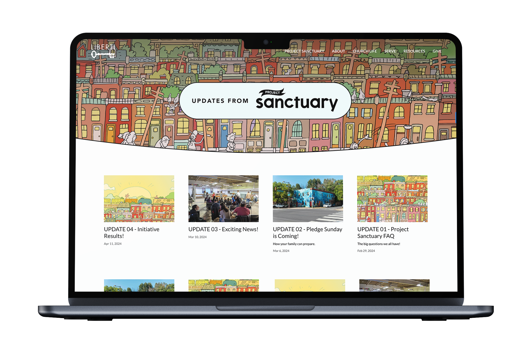
The Blog
In addition to the website, we also managed Project Sanctuary’s Blog. Its updates push through the ministry’s primary email chain as well as those subscribed to only the fundraiser updates.