
Arx Ventures wanted a rebrand, a new website, new videos, new photography… the works.
Here’s what we came up with.
Creative Director: Beau Rosario
Producer, Video Director: Brandon Gulish
Graphic Design: Grant Woodworth
Web Design: Beau Rosario
This part of our portfolio is not available for mobile viewing. Please open on a desktop device.
It begins with a mess…
Arx Capital & Arx Ventures specialize in opportunistic investment in the manufactured housing sector. Since they have two sides to their business (an investor side and a resident / property management side) we needed to create branding that could serve the needs of both. The primary goal was to create a new logo that felt more inviting, but kept the sense of strength the existing branding conveyed.


Studying the former logo, we discussed with Arx what story they wanted it to tell. Then, we began Step One of everyone’s creative process: throwing a ton of messy shapes and colors into Illustrator until ya get inspired.
Our Logo Designer, Grant Woodworth knew from the outset that the main driver of the art would be some abstraction of an actual arx. Endless googling of fortresses, and hundreds of reject concepts later, we came up with our final concept…
Old Branding


Brand Anatomy
A Simple Shape
After countless iterations, it’s become known around our office as the throwing star, postage stamp, or puzzle piece. The new Arx icon is most derivative of its Latin meaning: a stronghold. Arx’s mission is to present confident, resilient investment opportunities that deliver even in tough circumstances. The concept of a fortress felt particularly fitting to the founder when he named the firm, and the brand is emboldened by our simplified art, having condensed multiple themes into a unified form.
Strong curves and the pulled corners give this icon a sense of expansion and effort, while the color palette extends a more inviting hand. “Firm, but fair” is a bit of language used within the Arx team, and we wanted an icon that struck the same balance of strength and approachability.

Form and Function
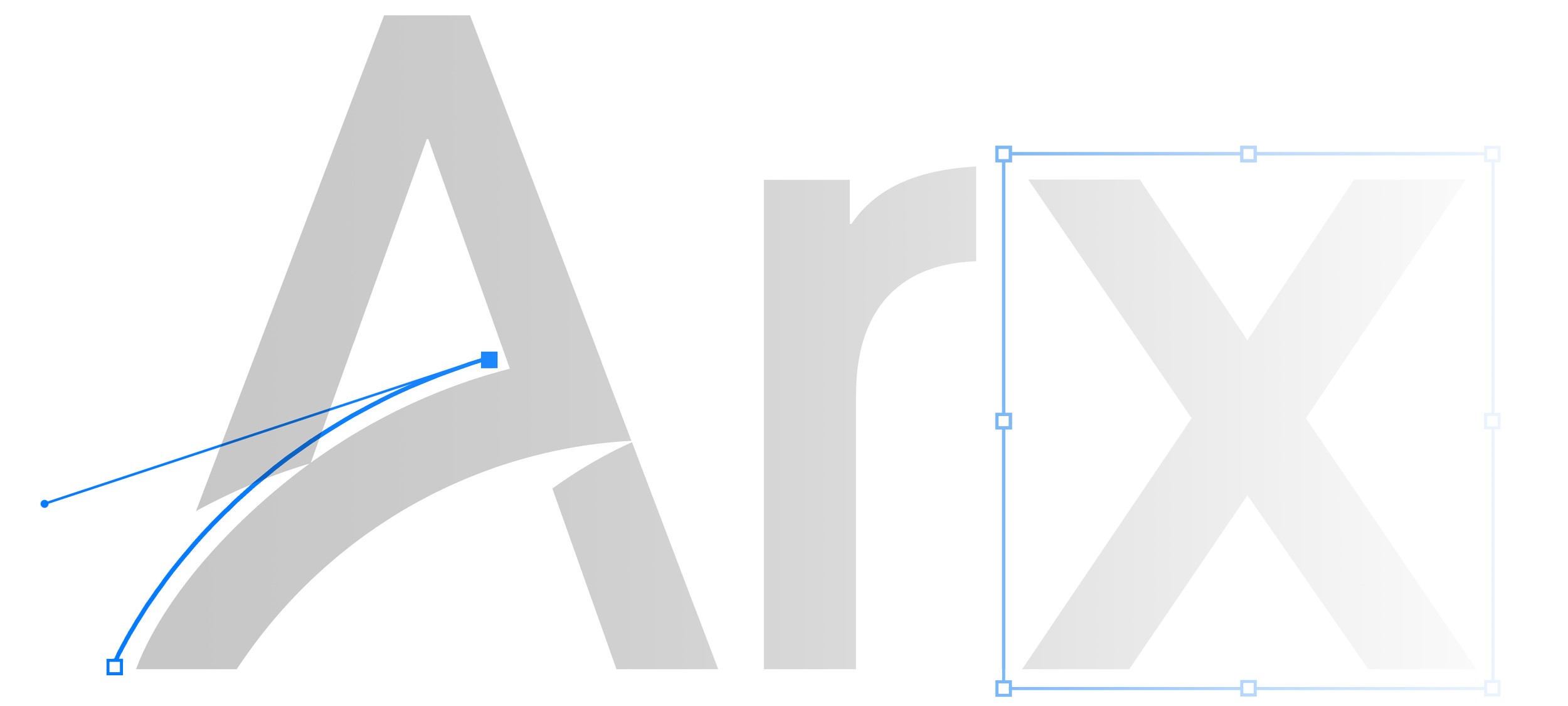
The wordmark needed to be ultra-readable and high contrast, but it needed to be more distinct than simply selecting a stock font. Ultimately, we modified a combination of characters from ITC Avant Garde Gothic Pro and Area Normal- most notably the letter “A.”
We wanted to preserve some of the former brand identity, and this was a perfect opportunity for us to pay homage. The rising curve representing growth was a natural fit for our leading character and is an underlying reminder that Arx is moving onward and upward. While in the previous branding it represented the ascension of a summit, we’ve embedded it within the font itself, creating a wordmark that can be recognized on its own- even without the icon.
Blues & Neutrals
The color palette was yet another opportunity for us to recall the former brand and problem solve. The more approachable royal blue and dusty turquoise is easier on the eyes, and we were able to use a modified shade of Arx’s dark gray for text. The new color palette gives the brand a fresh yet distinguished feel, keeping the brand comfortable for corporate investors and customers / residents alike.


Flexible & Recognizable
Can a five-year-old draw your logo from memory? Arx’s new icon passes the age-old test as easily remembered and easily identified.
Simplifying the color palette and icon structure enables us to reformat the branding in countless ways for any purpose or medium.

A DYNAMIC & FLUID WEBSITE

Any device, any format
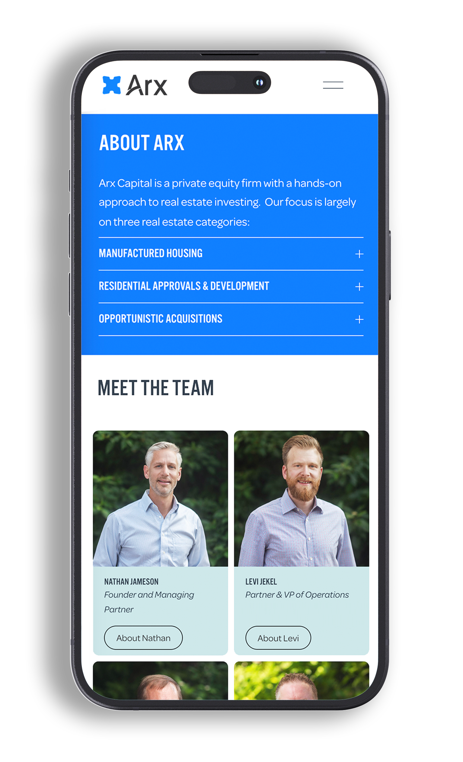
Arx is a modern and multifaceted company that caters to a diverse audience. Our challenge was to tailor content seamlessly across various mobile devices, ensuring optimal user experience regardless of screen size or platform. Through meticulous attention to responsive design principles and innovative technologies, we crafted interfaces that adapt fluidly to the unique characteristics of each device, maximizing accessibility and engagement.
Photography


Crafting a compelling digital presence goes beyond simply designing a logo and choosing colors. To truly resonate with their audience, Arx needed more than generic stock images and graphics.
Philamedia stepped in to provide a comprehensive solution, meticulously capturing Arx's company headshots, product photos, and aerial shots of their properties. This approach ensured consistency and authenticity, fostering a deeper connection with their audience.

Personalized Video Elements
Videos produced by yours truly introduces potential investors to Arx’s team and approach. Aerial cinematography, pre-production, post-production, and everything in between all done by our in-house creative team.

Custom Lightboxed Forms
Gated video content, email capture, and other types of data entry are utilized throughout Arx’s site, and integrated with the company’s Zapier and Mailchimp.

Testimonial Sliders
Custom testimonial sliders give readers the opportunity to hear from investors and residents alike.